
Regional Air Quality Council case study
Client: Regional Air Quality Council
Services: Design, Print
Walking on the Wild Side: A Critter-Forward Campaign for Better Air
Client goals
Regional Air Quality Council works to reduce emissions and improve air quality through programming and public education. They came to YellowDog for a cohesive, engaging campaign design and unifying branding for their various programs.
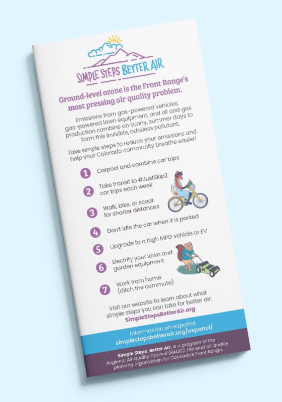
Simple Steps. Better Air.
RAQC’s annual “Simple Steps. Better Air.” (SSBA) campaigns inform and encourage action to protect the Colorado Front Range community from ground-level ozone. They were looking for a fresh take on a tricky topic for the 2024 ozone season (June – August).
Campaign goals fell into two categories:
- Awareness
- Increase public understanding of ground-level ozone as a threat to Front Range air quality, especially on hot summer days.
- Action
- Sign up for Ozone Action Alerts to be notified when ozone is high (via text or email).
- Take simple steps for better air.
- Take precautions when ozone is high.
Our task was to communicate a complicated (invisible) subject in clear, memorable, engaging visuals and as few words as possible, with a distinctive concept that would work just as well on a bus as on a website banner.
Program branding
SSBA is one of many programs under the RAQC umbrella, each developed over many years by different teams and with incompatible branding. As the overarching brand, the RAQC logo had to set the tone. At the same time, the SSBA logo had a different color palette and a more organic design. Alongside our campaign creation, YellowDog was tasked with creating new program logos that would coordinate with both.
Our Process
Discovery
YellowDog began by learning all we could about RAQC, their vision and goals. We had to understand the subject matter to distill a lot of information into a clear message.
The RAQC team got us off to a great start by compiling past campaigns along with notes on what worked and what didn’t. We learned that they didn’t take themselves too seriously and wanted to push the envelope. This groundwork allowed us to jump straight in and quickly grasp the task at hand.
Concept
Design and marketing joined forces to create campaign concepts that would communicate the problem (ground-level ozone) and drive action (signing up for text alerts and taking simple steps for better air). This integrated approach generated four concepts that we were excited to present to the client (and that we knew were achievable).
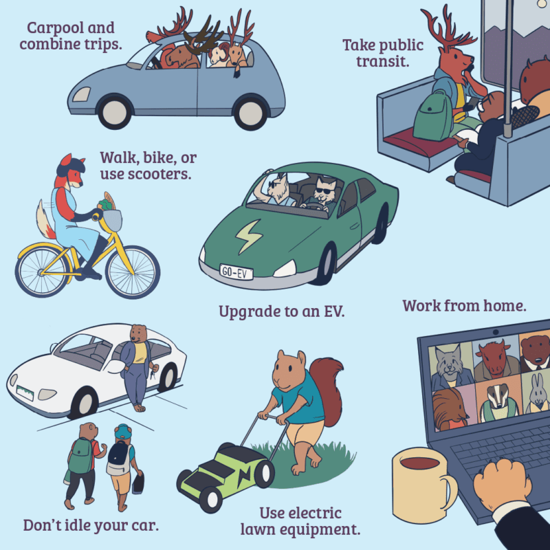
The winning concept was “Go Wild for Front Range Air Quality” – a series of stylized animals taking simple steps for better air, tapping into Coloradans’ shared sense of adventure and love of nature.
Copywriting
Next, we got to work turning our big ideas into concise text. We wrote copy for a suite of ads, one to illustrate each of seven simple steps:
- Carpool and combine car trips.
- Take public transit.
- Work remotely (skip the commute).
- Electrify lawn and garden equipment.
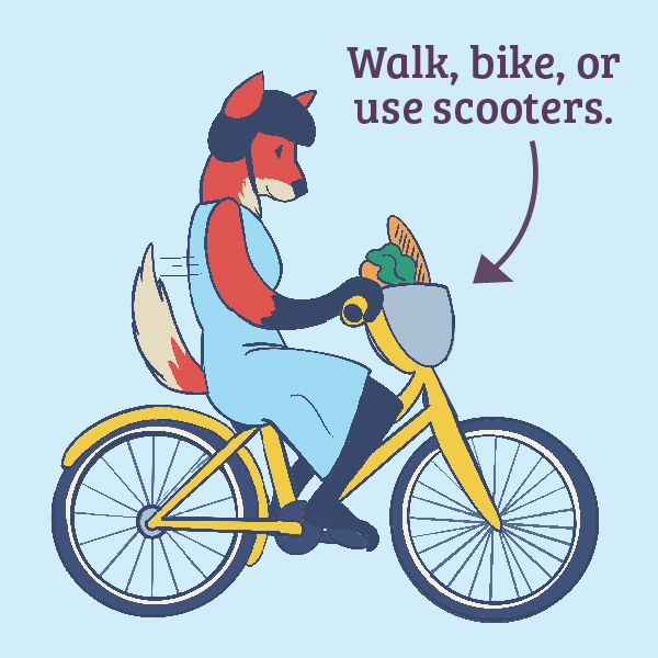
- Walk, bike or scoot instead of driving.
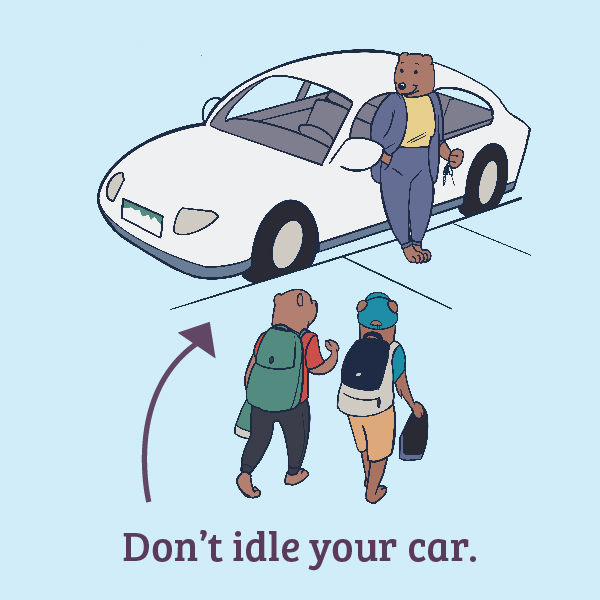
- Don’t idle.
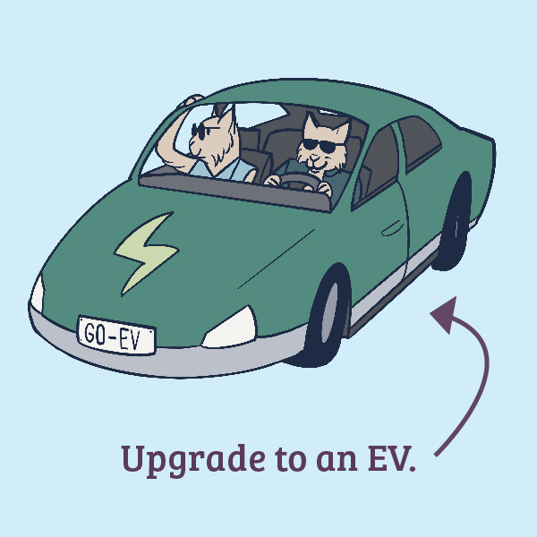
- Upgrade your ride.
We drafted catchy headlines and descriptive subheads for each ad along with informative blurbs and a call to action that imbued a sense of urgency and clear next steps. Because each ad would be designed in a wide range of sizes, we created tiered copy levels, with more information on larger ads and as few as 12 words on the smallest.
We incorporated visual concepting into the copywriting stage to ensure the smoothest possible handoff to design.
Design
How do you illustrate not idling your car? How could a single image depict the upgrade of your vehicle? These were big asks, but our in-house illustrator, Morgan, was more than up to the job.
![]()
She brought the concept and copy to life in a distinctive style that appeals to adults and children alike. Morgan added touches like lane lines to the bear mama’s parking spot and pops of color to critters’ scooters, creating simple visuals that evoke extremely clear, specific steps.
Execution
Once the creative was set, it was time to flex our organizational muscles. We worked with the client to track specs, deadlines, and the many individual units we’d need to create. Ads varied in size, orientation, and language (Spanish and English). The campaign debuted on Lamar Street buses in May and will roll out across print, digital, and media channels throughout the summer.
Program logos
To tie RAQC’s programs together with a more cohesive look and feel, YellowDog designed new logos for their other programs: “Clean Air Auto Repair,” “Engines Off,” and “Mow Down Pollution.”
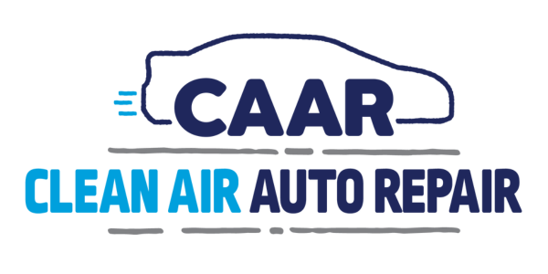
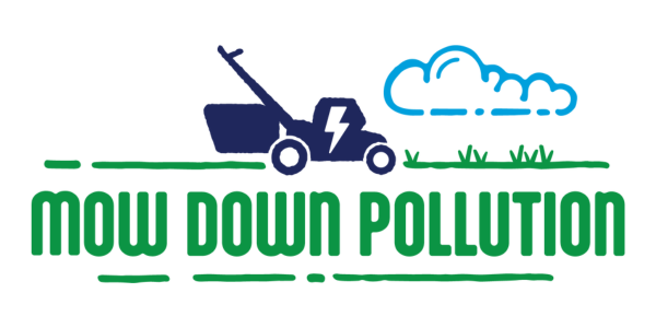
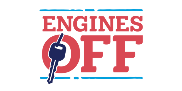
We drew inspiration from existing designs, incorporating RAQC’s color scheme and SSBA’s more organic look to create logos that would work well with both, each sized proportionally so that none had greater visual weight than the others.
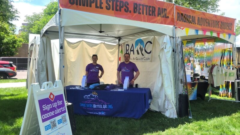
Events
To outfit RAQC to show off their new look at community events throughout the season, YellowDog designed and printed extensive collateral and swag, from brochures to signs and hats. We designed a rainbow twist on the SSBA logo for a special print run of our digital die-cut stickers to celebrate Pride month, along with standard logo stickers.
We designed staff t-shirts to spread the word and promote simple steps, portable signage and indispensable brochures detailing RAQC programs and simple steps everyone can take for better air.
Outcomes
The result was a cohesive, impactful campaign poised to protect the Front Range from harmful ozone this summer.
We successfully created a campaign that met the client’s stated goals–something that is memorable, specific, and clearly encourages taking simple steps and signing up for alerts.
RAQC is well on its way to reaching its campaign metrics with 170 new alert signups in the first month alone.