


To make sure you are ready to roll when opportunity strikes, we are breaking down the essential steps to maintain brand consistency as you grow.
So your brand is on the fast-track. But while business is booming, the brand may be slipping.
Whether you are going from solopreneur to big boss, one location to 50, or simply plotting your path to scaling success, a solid brand—deployed consistently—is a must.
When you’re growing quickly, needs will pop up everywhere. You suddenly need business cards for a flood of new team members. You’re hiring a marketing team (or an eager intern) to ramp up your social media. Media requests start rolling in. New locations need new collateral and swag but, oh no, all your designs just have your original location address.
To make sure you are ready to roll when opportunity strikes, we are breaking down the essential steps to maintain brand consistency as you grow.
Brand consistency is a uniform look, feel and tone, regularly applied to your business’s communications, products, materials and physical spaces. It’s a set of visual attributes and intangible traits that communicate who you are as a company.
Think of every touchpoint your audience might have with your brand—walking into your store, interacting with a staff member, seeing a social post or digital ad, receiving a mailer or seeing a flyer on the street. Brand consistency ties all of these interactions together like a snug leash—no wandering off!
Brand consistency builds recognition and trust. It is what turns every interaction from scattered happenstance to a steady build.
When your brand speaks in a single voice and presents itself in coordinated visuals and colors, you build familiarity and trust with your audience. It ties every positive experience together and makes your marketing work for your brand in subtle yet strategic ways.
As one marketing director and YellowDog client recently put it: “Brand consistency is everything to marketing.”
Before you can implement anything consistently, you need a well-defined brand identity. This is where professional support can really help to set you up with the tools you need to grow—without tripping over your own paws.
Your brand’s visual identity is more than your logo. It is all the graphic attributes that contribute to your brand’s aesthetic.
If your logo is your signature accessory, your visual identity is your entire wardrobe—artfully crafted to turn heads, always true to what makes you uniquely you.
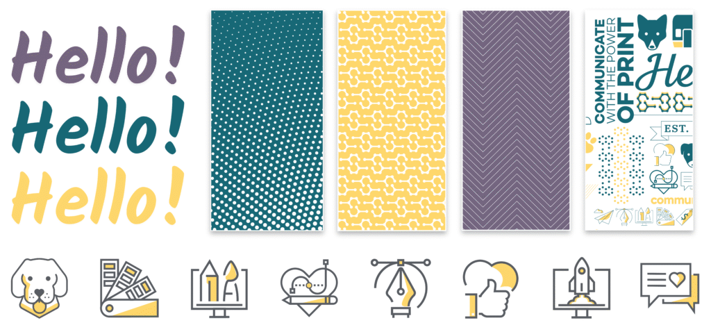
Visual identity includes your logo (of course), but also colors, fonts, style and design elements.
Like a user manual for your visual identity, brand standards lay out how each element works in the real world. Your brand standards will include guidance on:
Having logo use, color builds, and typography spelled out makes it easy to delegate design tasks without sacrificing brand consistency.
Beyond visuals, nailing your messaging means your brand can speak in one voice—no matter who’s behind the keyboard (or the leash).
Pro tip: Figure it out once, then check in regularly to keep it fresh. While your core message shouldn’t change, periodic check-ins keep your messaging top-of-mind and aligned with your growth.
A bunch of guidelines aren’t going to do much good floating around in ten different documents on three different servers. Bring your shiny new brand identity, messaging and standards together in a comprehensive brand guide. Name it clearly, include the date it was last updated, share it broadly and keep it somewhere easy to find.
Once your visuals and messaging are solid, it’s time to put them to work—consistently. Your brand guide is your secret weapon: share it with everyone creating content for your brand, and point folks back to it when inconsistencies sneak in.
Train your team and partners to stay true to the guide, and you’ll build a shared language that gets easier to replicate every time.
Next, build your brand kid into the platforms where you are creating content.
Professional designers can load color palettes and fonts into platforms like Adobe Illustrator and InDesign. As long as you share your brand guide with your designer, they should be able to take it from here.
For non-designers, colors, fonts, logos and graphic elements can all be loaded into user-friendly platforms like Canva. Brand colors can easily be applied to any design, and your fonts and graphics are never out of reach.


Templates are a great way to use your design resources wisely—invest in a few (three to five) professional templates, and repurpose them like a pro.
YellowDog can even load these templates into your Canva account, ready for your team to use—no paws left behind. Just remember to start from those brand templates every time. (Otherwise, that polished look might wander off the leash!)
Don’t forget to add your brand voice to your Canva brand kit for AI-supported content creation.
Each major email platform has its own quirks, but whether you are using Constant Contact, Klaviyo, or any one of their many, many competitors, you’ll want to get your brand kit loaded in there pronto. Once again, that’ll include your colors, fonts, logos and, usually, something about your brand personality.
Create templates for the types of emails you send most often: monthly newsletters, weekly digests, event promos, special offers. Work with a designer to nail down the perfect layout and secondary fonts. Then you won’t have to bug them every time.
You can also load your logo, icons and brand photography into your email content library to have handy for future campaigns.
Your print program is where your brand gets out from behind the screen and into the real world. Print is central to business operations. It’s also harder to update and easy for digital-first marketers to overlook, making it a thorn in the paw of brand consistency.


The lasting nature of print makes it even more important to get it right the first time. Luckily, we’ve got a few tricks up our sleeves when it comes to brand consistency in print.
YellowDog ties all of this together in our custom print portals: your online storefront for approved, on-brand print.
We build brand standards, variable templates and structured permissions into a centralized platform that makes managing print a breeze. Corporate decision-makers can even control who sees what—no chance of ordering the wrong materials.


Then we (your trusty print partner) check each print against approved samples—so you know you’re getting the same quality every time. Now that’s consistency delivered.
If you’re serious about maintaining brand consistency in your print program as you grow, you’re gonna want a print portal.
What’ve we learned today, pups? That brand consistency is key. You need solid brand standards. Templates are your friend. Print portals, structured permissions and a trusted partner will make everything better when the pressure is on.
Ready to build your portal? Let’s talk about your big idea.